The Art of Menu Design: Color Psychology
Did you know that color is a foundational element of menu design?
This is because color is one of the most powerful communication tools that marketing companies can use due to its ability of affecting and influencing their customer’s moods, reactions & actions.
For years, marketing companies and advertising agencies have studied how certain colors affect human behavior and decisions. Within their research, they’ve discovered that people are attracted to certain colors over others in each type of industry, such as the fashion world or the food business. This means that as a business owner, you have to strategically choose a color scheme that will work well within your field of work.
In the food industry, color says a lot about who you are and what your restaurant is all about.
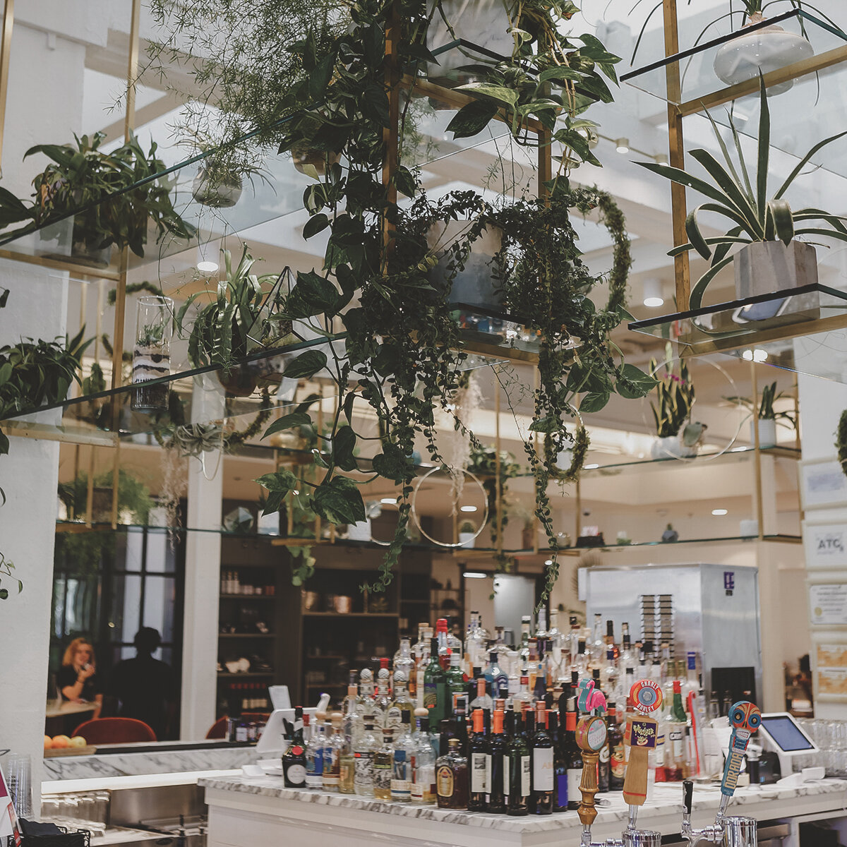
Imagine a group of businessmen go to visit a high-end Michelin restaurant. As they enter the restaurant, they look around and see that the whole entire interior is neon orange, mold green and mustard yellow. When they receive the menu, they find that it’s covered in an arrangement of colors making the text difficult to read. At this point, they’re probably feeling disgusted, shocked or downright confused. Some of them might even be at the point where they’re ready to get up and leave before they’ve even tasted the food. Why? Because you wouldn’t expect the interior and menu of a luxurious restaurant to look like that.
However, if they walked into this restaurant and saw that the interior was black and white with gold accents and had a menu that was clean and easy to read, they would probably have a much more enjoyable time. This is mainly because people tend to associate colors like black, white and gold with something being fresh, classic and luxurious, which is exactly what you’d expect in a Michelin star restaurant. This is why restaurants and businesses have to be careful with the colors they choose for their company. The colors you put in your logo will most likely carry into your menu design, your interior decor and your overall brand.
To help give you an idea on what type of message each color conveys in marketing, we created a quick breakdown of color meanings below.

BLACK
Represents elegance, formality, boldness & power.

BLUE
Represents trust, tranquility & loyalty.
GREEN
Represents freshness, organic and environmentally friendly.

ORANGE
Represents value, confidence & friendliness.

PURPLE
Represents sophistication, quality & creativity.

WHITE
Represents purity, clean & modern.

BROWN
Represents honesty, simplicity & wholesomeness.

GREY
Represents formal, graceful & sleek.

PINK
Represents hope, love & compassion.

RED
Represents passion, urgency & fierceness.

YELLOW
Represents happiness, energy & warmth.
Out of all the colors listed above, red and yellow happen to be the most popular colors in the food industry because they have the ability to capture people’s attention and spark their appetite. This is why so many food chains, such as McDonalds, Burger King, Johnny Rockets & Popeyes, use these two colors together in their branding.
So before you create your new menu, make sure to take the time to choose a color scheme that reflects you and your restaurant’s brand. If you want to learn more about color psychology & marketing, check out this article by Kendra Cherry or this article by Nicole Martins Ferreira.
Want more tips on how to design, write or create your menu? Join our mailing list below for tips, freebies, recipes and so much more.